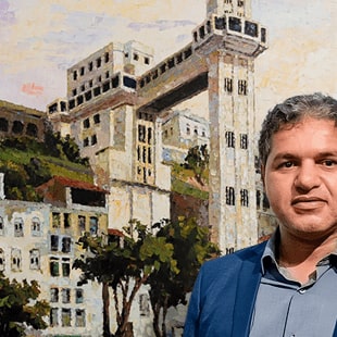
My passion for graphic design began in my late teens when I co-founded a small print shop alongside two childhood friends. That business became my first real laboratory, where self-taught instinct met the discipline of professional production.
This timeline traces a design journey that refuses to stay in one lane: from hand-crafted posters in pre-internet Brazil to AI-generated video campaigns in New Zealand; from the LED screens of Pacha Barcelona to the touchscreen kiosks of a presidential office; from building a brand from the ground up as CMO of a premium fitness club to designing urban planning tools that shaped entire cities.
Branding and editorial. Interface and motion. Urban marketing and luxury packaging. Research that became a real tool in real classrooms.
What you’ll find here is a curated selection—a few milestones chosen to show how the thinking evolved. The through line isn’t a style or a medium; it’s a way of thinking: that design, at its best, solves problems and tells stories at the same time.
My passion for graphic design began in my late teens when I co-founded a small print shop alongside two childhood friends. That business became my first real laboratory, where self-taught instinct met the discipline of professional production.
Eager to expand my knowledge, I moved to Hawaii, drawn as much by a lifelong passion for surfing as by the pull of a new creative environment. I studied Graphic Arts at Maui Community College, and that chapter, where the ocean and the studio coexisted naturally, shaped everything that followed.
Back in Brazil, I pursued formal education in Social Communication with a focus on Marketing, and while still in that degree, I found myself channelling both worlds in practice, working as Art Director and Urban Marketing Consultant at URBE Planejamento Urbano. It was the moment design and strategic thinking first converged for me in a meaningful way.
Before completing that degree, I made another pivotal decision and moved to Australia, where I completed a Bachelor’s degree in Graphic Design, followed by postgraduate studies in Audiovisual Production in Barcelona.
Years later, back in Brazil, I took on a different kind of challenge, joining Ecohit Wellness Club as Chief Marketing Officer, where I led the brand strategy from launch through to the club’s acquisition by the largest premium fitness network in the country’s North and Northeast. Most recently, I completed a Master’s degree in emerging technologies in New Zealand, where I continue to work at the intersection of design, technology, and human experience.
Outside of work, I channel my creativity into making things with my hands. A surfer since childhood, I now give back to the sport by crafting sustainable hollow wooden surfboards, documented on Instagram at @rakausurfboards, and take on woodworking and CNC projects whenever the opportunity arises.
Design, for me, has never been about a single medium or discipline. It’s a way of thinking that moves across surfaces, screens, cities, and now classrooms, always in service of a story worth telling.
Design, AI, and Belonging in the Classroom
academyEX Master’s Degree (2026)
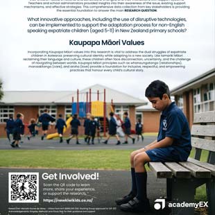
This year I completed my Master’s degree at academyEX in New Zealand, with research focused on the adaptation challenges faced by non-English-speaking expatriate children. What began as a deeply personal experience grew into a rigorous academic investigation that brought together interaction design, artificial intelligence, and Kaupapa Māori values.
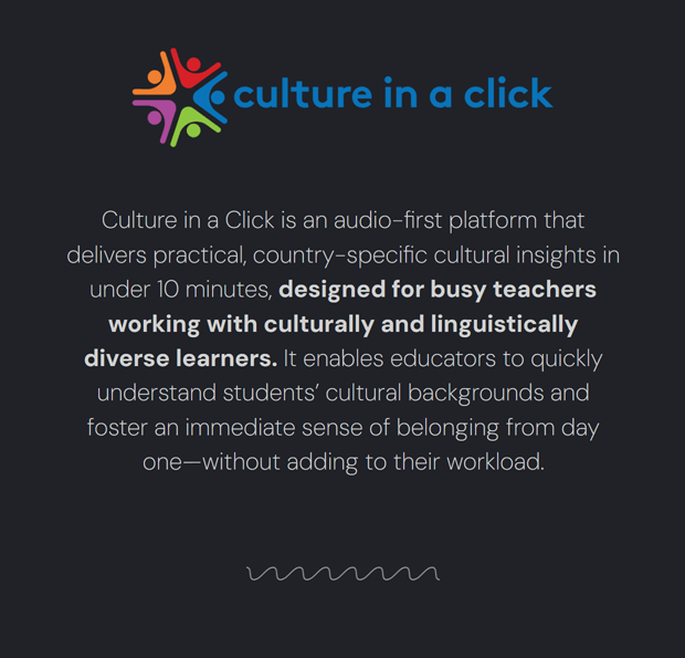
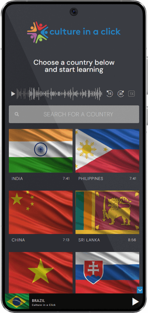
The practical outcome of my research was the development of three technological interventions, with Culture in a Click as the centrepiece. The platform is an audio-first micro-learning tool designed to give teachers practical cultural insights and native-language greetings in under ten minutes, lowering the barrier to meaningful connection from the very first day of school.
Currently being piloted in a number of New Zealand schools, the project demonstrates how technology, when rooted in the values of Manaakitanga (care and hospitality) and Whanaungatanga (relationship and belonging) can humanise the experience of migration and ensure that every child feels truly seen and supported from the moment they walk through the door.
Strategic Design and Generative AI for Ethical Finance
Mindful Money NZ (2025)
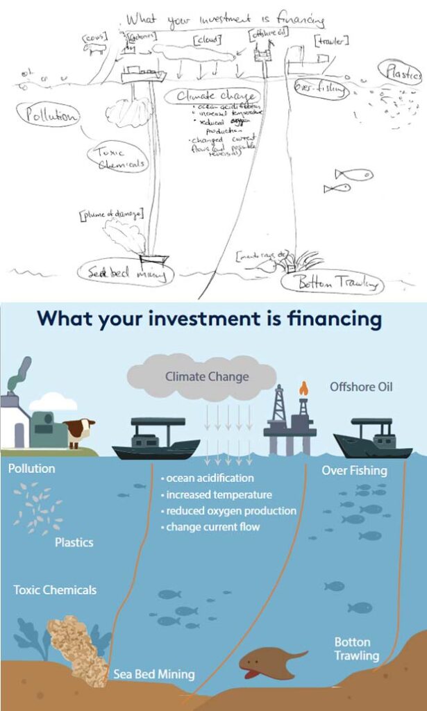
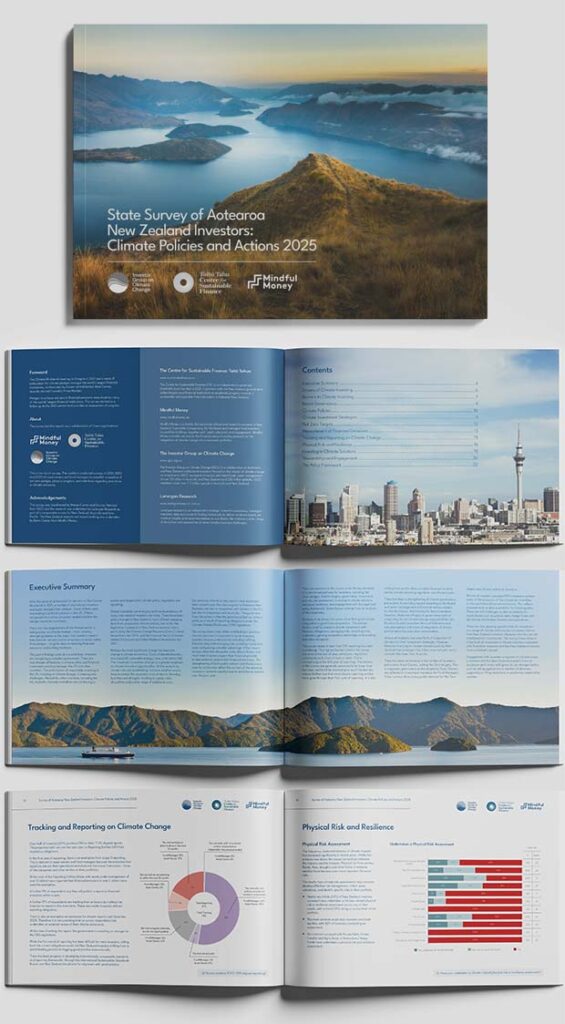
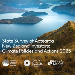
In March 2025, I began my journey in the New Zealand market at Mindful Money, a non-profit organisation dedicated to promoting ethical investment, where I am responsible for the graphic design work. This includes logo and icons development, infographic creation, and the layout and visual treatment of complex reports, with the core challenge of transforming content around finance and sustainability into editorial pieces that are clear, professional, and visually compelling, ensuring that technical information is both accessible and impactful for investors and partners.
Building on that editorial foundation, I explored new digital territory to amplify the organisation’s mission, developing a series of short video ads using Generative AI tools to produce realistic video content. The goal was to spark public curiosity about where KiwiSaver funds actually go. This approach reflects the broader shift toward using generative AI to produce high-impact visual content at a fraction of the traditional production cost, allowing complex messages to reach wide audiences in ways that are fast, shareable, and deeply engaging..
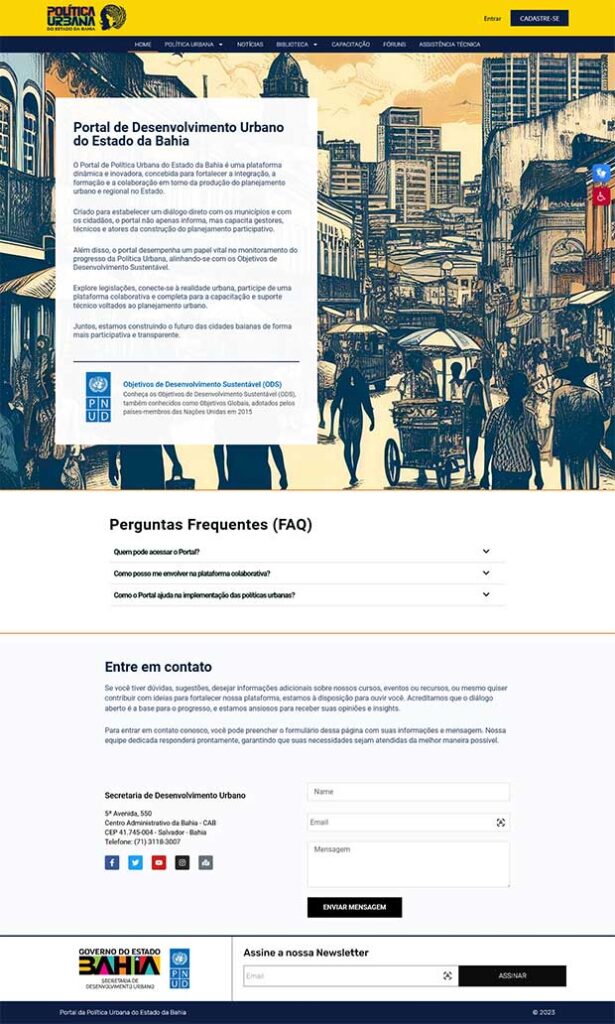
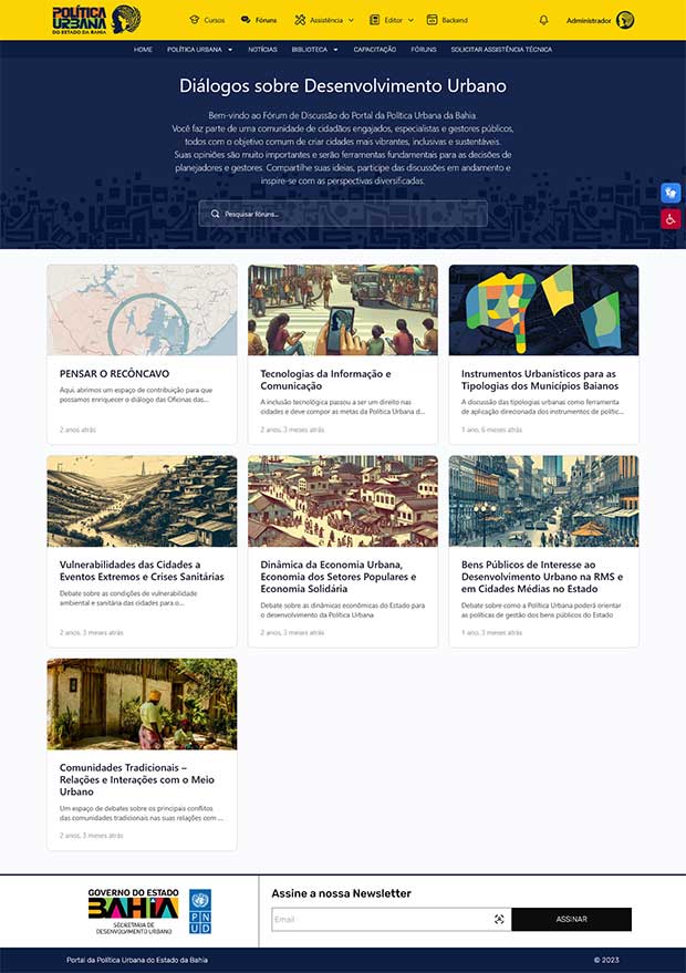
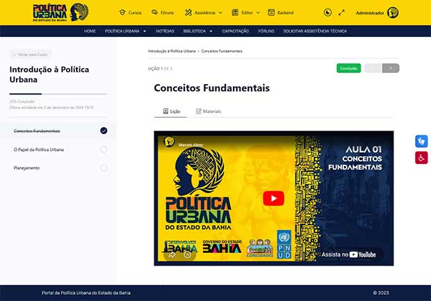
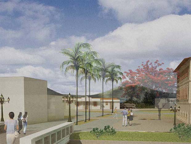
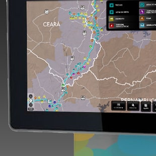
In 2024, I was responsible for the full conception and development of the Portal da Política Urbana da Bahia — the Urban Policy Portal of Bahia. The project was designed to serve as the digital backbone of urban planning across the state: a formative, integrative, and transparent instrument for public administrators, technical staff, and citizens alike.
Built entirely in WordPress, the portal was structured to support a complex network of collaboration and knowledge exchange. The technical challenge was to create a platform that brought together four fundamental pillars: a legislation library spanning federal, state, and municipal levels; content on the urban realities of Bahia; a collaborative space for knowledge sharing; and a channel for government technical assistance.
The interface was designed with civic accountability at its core. Through an intuitive and accessible layout, the portal enables the monitoring of urban policy through indicators aligned with the Sustainable Development Goals. It is a dynamic tool that translates technical data into practical knowledge, strengthening democratic participation and ongoing capacity building across the entire state of Bahia.
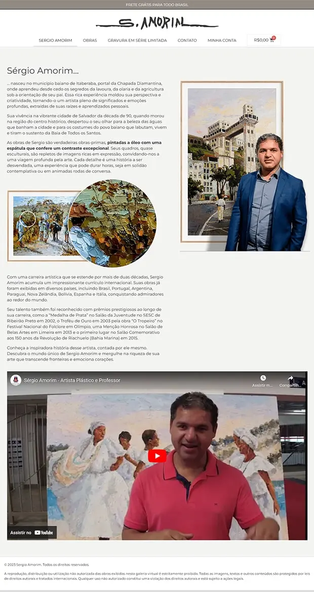
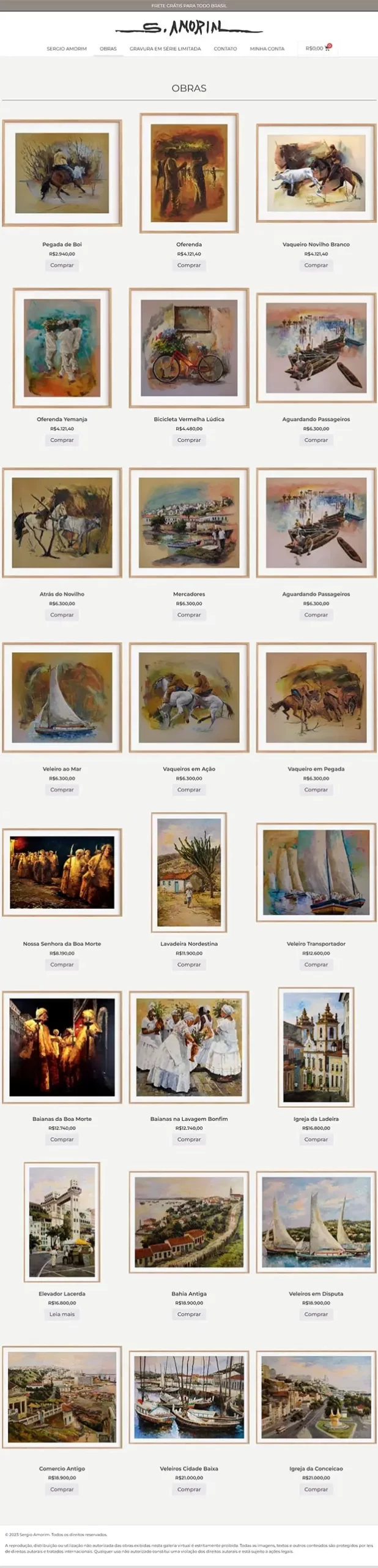
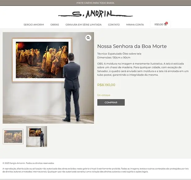
In 2023, I was brought in to create the virtual gallery and sales platform for renowned visual artist Sérgio Amorim. The challenge was to build a digital environment that didn’t merely function as a storefront, but genuinely honored the aura and sophistication of the artist’s physical works.
The e-commerce platform was built entirely in WordPress, with WooCommerce as the sales engine. This technology stack enabled dynamic inventory management, secure transactions, and a user-friendly interface. The layout was conceived to be clean and deliberately minimal, ensuring that the colors and textures of the paintings remained the true protagonists of the browsing experience.
Beyond the technical architecture, I focused on information design to make the site feel like a natural extension of the artist’s studio. From the artist biography page through to the detailed presentation of each work, every element was crafted to convey Sérgio Amorim’s trajectory and standing, making it easier for collectors to connect with the art regardless of where in the world they happened to be.
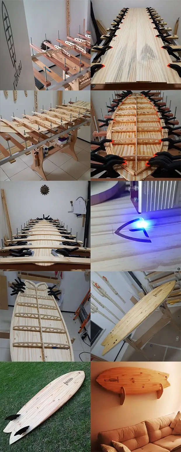
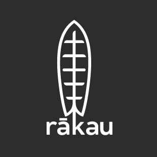
In 2022, I fulfilled a long-held ambition to merge my passion for surfing with product design through the launch of Rākau Surfboards. There’s a curious footnote to the name: I chose “Rākau” — the Māori word for wood — without any idea that New Zealand would soon become the setting for my Master’s degree. The project centers on the creation of hollow wooden surfboards, built from sustainable materials through a process that balances digital precision with hands-on craftsmanship.
The creative process begins on the computer, where the final design is exported for CNC cutting, ensuring precision in both hydrodynamics and structure. From that point on, the work becomes entirely manual: assembling the stringers, closing the frame with wooden skins, shaping, and final lamination in eco-friendly resin.
Every Rākau board is a one-of-a-kind piece, replacing the highly polluting polyurethane foam block with a living, durable structure. This project reflects my ability to move fluidly between precision software and woodworking tools, resulting in a high-performance product that is, at the same time, a functional work of art.
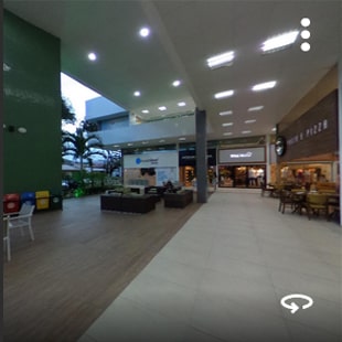
In 2017, I expanded my creative practice into immersive photography. Using Google-recommended technology (the Ricoh Theta camera) I specialized in creating virtual tours, earning the official Street View Trusted badge in the process
More than a professional pursuit, this was driven by a genuine fascination with the medium. Most projects were done for friends’ businesses, born out of curiosity and a love for the craft rather than commercial ambition.
Over seven years, I developed projects published both directly on Google Maps and on custom platforms such as Kuula.co, offering tailored virtual navigation solutions. The impact of this work is both measurable and global: my photographs and tours have now surpassed 1.5 million views, connecting people to places around the world.
I remained active in the program until its global discontinuation at the end of 2024. One of the final milestones of this chapter was producing the virtual tour for academyEX in New Zealand — the institution where I completed my Master’s degree.
Building a Brand from Launch to Acquisition
Ecohit Wellness Club (2017–2021)
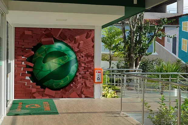
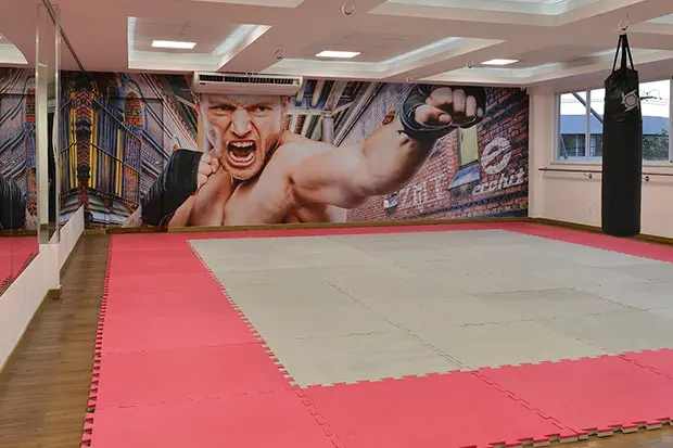
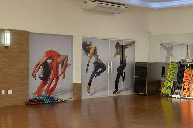
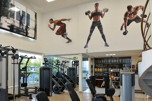
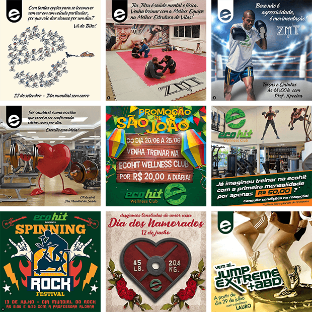
Between 2017 and 2021, I joined Ecohit Wellness Club as Chief Marketing Officer (CMO), taking full ownership of the brand strategy from the club’s opening day through to its acquisition. The role was genuinely multidisciplinary, spanning market positioning, business strategy, communications, social media management, events coordination, and digital innovation.
One of the cornerstones of the brand positioning was the physical space itself. I led the development of all internal and external visual communications, including large-scale environmental installations that transformed the functional spaces of the gym into an inspiring, high-performance environment. Every detail was designed to reinforce the brand’s identity around wellness, aspiration, and premium experience, turning the club itself into the most powerful marketing asset we had.
During the critical period of COVID-19, I led Ecohit’s transition to digital, conceiving and implementing a Live Classes program that reached over 2,000 users. At a moment when the entire fitness industry was losing members to uncertainty, this content strategy kept the community engaged, protected retention, and maintained the brand’s relevance and social value with the doors physically closed.
The success of the overall strategy culminated in 2021, when Ecohit was acquired by the largest premium fitness network in Brazil’s North and Northeast regions, with our unit becoming the standout location across the entire chain. It was clear validation that strong brand positioning, strategic leadership, and a consistent customer experience are not just creative outputs, but high-value business assets.
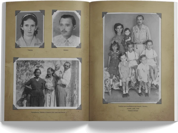
Design as Legacy and Memory
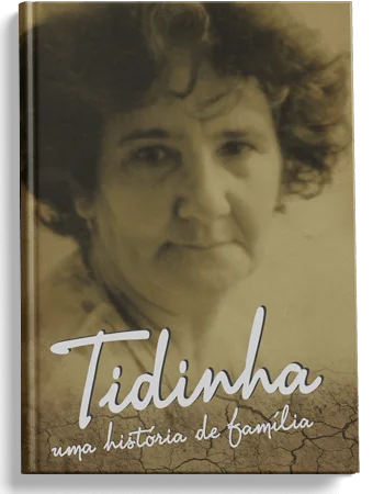
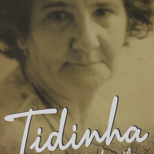
Tidinha: A Family Story (2012)
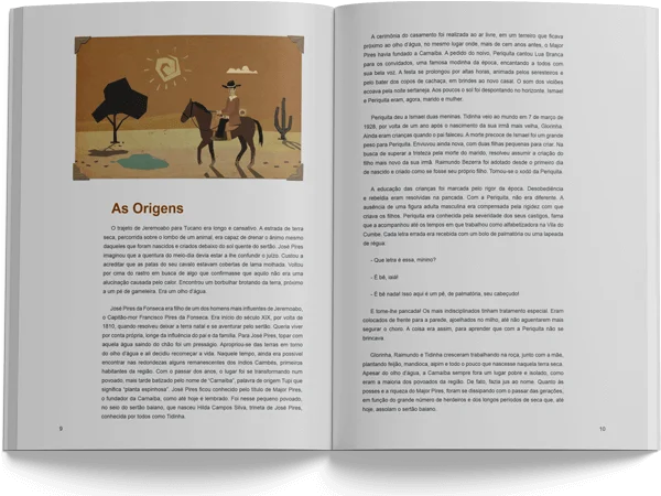
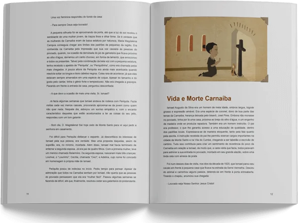
To celebrate my grandmother’s 80th birthday, I conceived and designed this book chronicling the saga of the Abreu family. More than a graphic project, it was an act of documentary preservation. The story of a family of migrants from Euclides da Cunha, deep in the Bahian sertão, who faced drought and hardship to rebuild their lives in the state capital.
The book was built by many hands. The prose was written with great sensitivity by my eldest brother, Márcio Abreu, and the illustrations punctuating the historical passages were created by a close friend. My role was to orchestrate these elements into a layout that honored both the solemnity and the tenderness of the journey being told.
The graphic design draws on an earthy color palette and paper textures that evoke the landscape of the Brazilian interior. I wove together old photographs from the family archive with illustrations rooted in the visual imagination of the Northeast, building a rhythm that carries the reader from the hardest of beginnings to the quiet triumph of a matriarch who, after losing her husband far too soon, raised ten children on her own.
“Tidinha: A Family Story” is proof that design reaches its highest purpose when it serves to keep a life’s story alive. This book was never made for bookstore shelves. It was made to become the most treasured object in our family library, preserving the strength of our origins for the generations that follow.
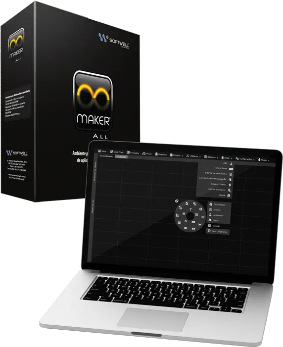
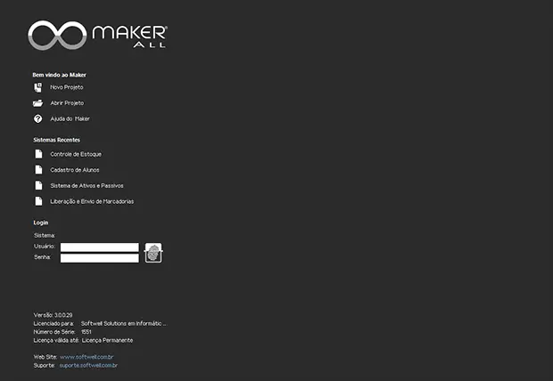
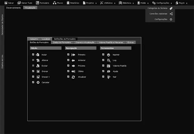
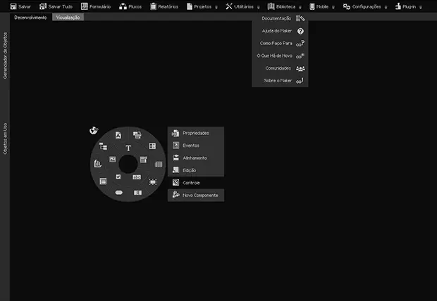
In 2012, I was brought in to redesign Maker 3, Softwell’s flagship low-code platform. The project represented a generational leap for the software. Where the previous version, Maker 2, followed the standard Windows aesthetic of the time, with colorful icons and light interfaces, I chose to take the design in an entirely different direction.
Drawing inspiration from the handful of forward-thinking tools that were beginning to experiment with dark themes, professional editing suites and developer IDEs, I built the entire Maker 3 interface around a Dark Mode concept. The goal was to offer a more sophisticated, focused environment that reduced eye strain for developers, anticipating by years what would eventually become the industry standard for modern applications.
Beyond the radical shift in color palette, I undertook a thorough simplification of the icon system. The dated aesthetic of Maker 2 gave way to cleaner, more restrained flat icons that communicated each function with greater visual clarity. The introduction of a radial menu and minimalist login screens gave the platform a premium, technology-forward feel, significantly raising the perceived value of the product..
Editorial Design, 3D Visualization, and Luxury Packaging
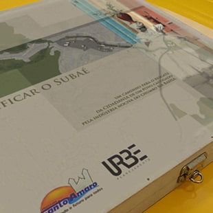
Purificar o Subaé (2010)
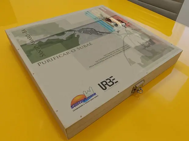
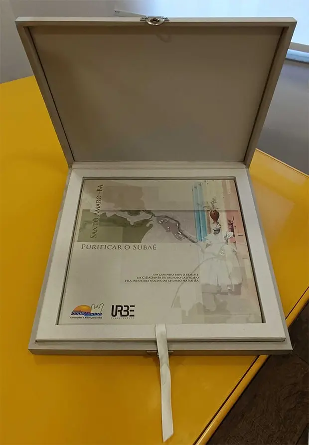
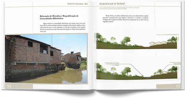
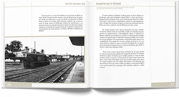
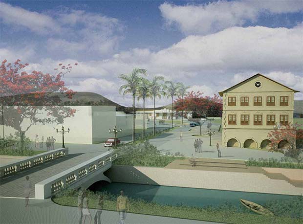
In 2010, I worked on the Urban Planning document for the depollution project of the Subaé River in Santo Amaro, Bahia. The work went well beyond conventional layout, delivering a high-value package that brought together strategic design, architectural visualization, and handcrafted presentation.
For the final presentation to authorities, I developed an exclusive packaging solution: a custom-made wooden box with a velvet interior lining, transforming the technical report into a prestige object. I oversaw the entire process, from the conception of the visual identity through to material selection and the final layout execution.
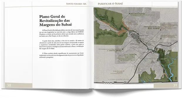
A technical highlight of this project was bringing the urban proposals to life. I used SketchUp to model the proposed interventions along the riverbanks, V-Ray for rendering, and Photoshop for post-production. These images were essential in allowing decision-makers to grasp the real impact of the proposed interventions, the restored quayside, the riparian vegetation, and the new cultural spaces envisioned for the city.
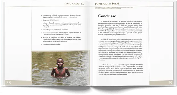
The document weaves together original black-and-white photography capturing the soul of Santo Amaro with clean technical maps and infographics. The result is a design piece that doesn’t simply propose technical solutions, it tells the story of a community and its call to be heard, framing environmental restoration as an act of civic dignity.
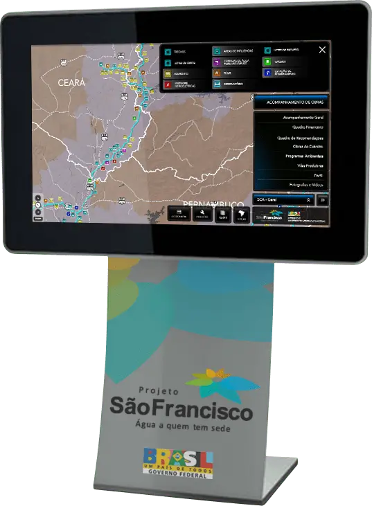
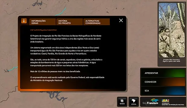
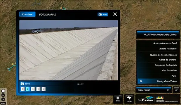
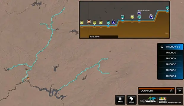
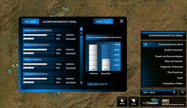
Returning to Brazil in 2009, I once again took on the role of Art Director at URBE Planning, this time leading one of the most nationally significant projects of the period: an interactive monitoring system for the São Francisco River Transposition works. We developed a platform installed on touchscreen kiosks strategically placed in the Minister of Integration’s office and in the anteroom of the Presidency of the Republic.
This was a complex software engineering and UI design undertaking. I built the system using Flash, already part of Adobe, with ActionScript integrated with XML files, allowing construction data to be updated remotely. The result was a dynamic control panel capable of monitoring the physical and financial progress of the country’s largest infrastructure project in real time.
This project marked my farewell to Flash, which from 2010 onward would gradually give way to HTML5. The system remained active and fully operational through the end of the presidential term in 2010, serving as a critical decision-making tool. It stands as a high point in the use of interactivity for public data transparency and governance in Brazil, pairing technical rigor with an interface that felt intuitive and forward-looking by the standards of its time.
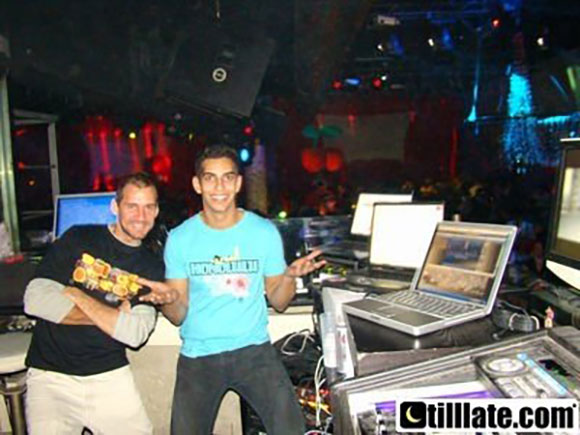
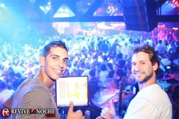
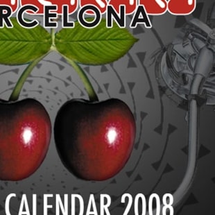
Audiovisual at the World Capital of Clubbing
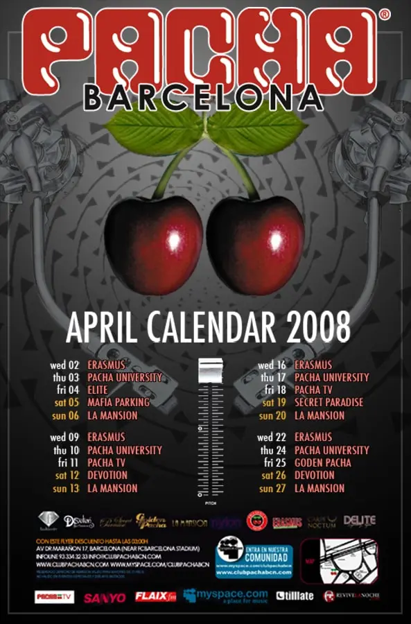
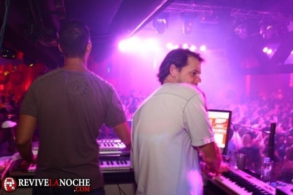
Pacha Barcelona (2008)
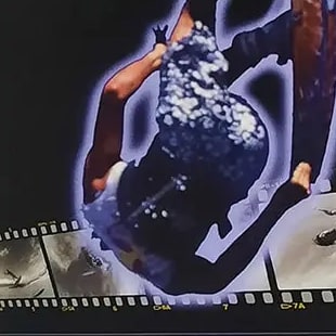
During my time in Barcelona, I worked as resident VJ at the iconic Pacha, running the visual projections night after night. It was a deep immersion into European nightlife culture. I wasn’t just operating the visuals each evening, but also creating design pieces and Motion Graphics videos for the club’s massive LED panels and projection screens.
Most of that archive, hundreds of artworks, videos, and photographic records, was lost when my luggage and a hard drive went missing on my return to Brazil. The “April Calendar 2008” poster and the promotional video are the precious few pieces that made it through, and they stand as examples of the vibrant visual style and technical precision demanded by a global brand like Pacha.
As a VJ, my work was about creating a symbiosis between music and image. Producing videos in After Effects for Pacha’s nights required dynamic thinking: the color palette, the rhythm of the edits, and the information hierarchy in the flyers all had to reflect the energy on the dance floor. These recovered pieces are small fragments of a year of intense creative output at the epicenter of Spain’s electronic music scene.
Design, Sound, and the
Avant-Garde in Barcelona
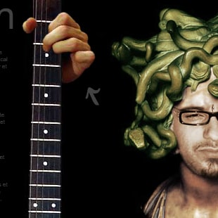
Munir Hossn Experimental Web (2007)
During my postgraduate studies in Audiovisual Production in Barcelona, I developed this experimental website for multi-instrumentalist musician Munir Hossn. The project was conceived at the height of the high-impact web era, when Flash allowed the interface itself to become an extension of the artist’s work.
The goal wasn’t simply to inform, but to translate Munir’s complex musicality into a visual experience. The fluid navigation and organic transitions were designed to mirror the rhythm and sophistication of his sound, creating an immersion where users could feel the brand before they had read a single word.
Being in Barcelona, one of the world’s great design capitals, had a direct influence on the project’s aesthetic. This website served as a laboratory for exploring how audiovisual design could break free from the static grids of conventional web design, turning the browser itself into a digital stage.
Bachelor's Degree and Technical Experimentation
Bachelor of Graphic Design (2005–2006)
In 2005, after two and a half years studying Marketing in Brazil, I made the decision to put my degree on hold and move to Australia, beginning one of the most transformative chapters of my career at Sydney Graphics College. The international academic environment became the perfect laboratory for pushing boundaries and exploring a wide range of visual languages, bringing together the strategic grounding I had already built with the creative freedom and technical rigour of tools that were actively shaping the future of the industry.
One of the defining milestones of this period was the “Kite Season” animation, a simulated broadcast promo for a fictional series on Channel 10. The project received academic recognition that year for the complexity of its execution. Every illustration and background was created in Illustrator, animated frame by frame in Flash with ActionScript controlling the flow, and the soundtrack was composed in GarageBand. It was a one-man-band exercise that proved how design could move and engage across time.
Beyond the moving image, the degree allowed me to move across disciplines and build a practice that resisted easy categorisation. In technical illustration and 3D, I explored the precision of vector drawing and the mechanics of modelling and animation. In editorial design and packaging, I pushed against conventional layout and experimented with the structural engineering of print. And through collage, image manipulation, and bold visual provocation, I explored design as a tool for cultural commentary and critique.
This period in Australia wasn’t simply about learning software. It was about mastering the ability to adapt technique to message, regardless of the medium, whether printed paper, an LED screen, or a three-dimensional space.
Design and Marketing
in Service of the City
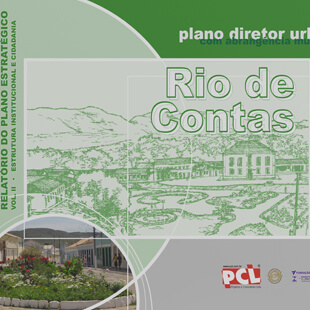
URBE Urban Planning (2004)
Back in Brazil in 2004, while in my second year of a Marketing degree, I took on the role of Art Director at URBE Urban Planning. This project represented a shift in scale: eight years of graphic design experience now applied to shaping and communicating documents that would define the future of nine municipalities across Bahia.
I was responsible for the visual identity and complete editorial production of nine Municipal Master Plans. The work demanded meticulous organization, integrating large volumes of data, developing technical maps, infographics, and original photographic records. The goal was to transform dense technical information into reports that were readable, visually compelling, and accessible to both public administrators and civil society.
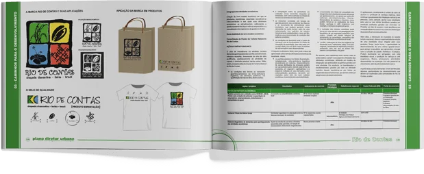
Beyond the visual work, I also authored the Urban Marketing sections of each plan. I developed city branding strategies, creating identities and marks aimed at boosting tourism and driving local development, as seen in the project for Rio de Contas. It was the moment design and marketing converged to think of the city as a social, historical, and economic product.
The Golden Age of
Macromedia Flash
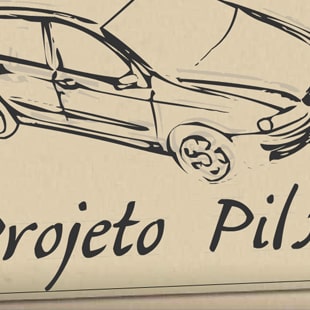
Casa Amorim: Projeto Piloto (2002)
In 2002, digital design was at peak Flash. It was the era when agencies and artists were pushing interactivity to its limits and I was brought in to develop the microsite for the Casa Amorim Projeto Piloto campaign, one of the most established names in construction materials in Bahia.
Unlike the static websites of the time, this microsite was built to be a fluid experience. Flash made it possible to create cinematic transitions, animated menus, and intuitive navigation that walked users through the project’s highlights.
Building in Flash required a careful balance of design, animation, and programming through ActionScript. The challenge was delivering the rich, sophisticated aesthetic associated with major film and global brand microsites, adapted for a regional market. This project cemented my transition into interface design, where aesthetics had to move in lockstep with functionality and the loading constraints of the internet at the time.
Design for the
American Specialist Press
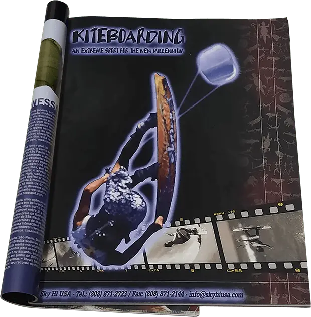
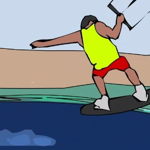
Sky Hi USA (2000)
Still living in Hawaii in 2000, I was brought on to create the launch campaign for Sky Hi USA, a personal venture by my brother, Mauricio Abreu. The ad ran in specialist kitesurfing magazines across the United States, marking another milestone in our creative partnership at a moment when the sport was exploding in popularity.
As the piece itself declared, “An extreme sport for the new millennium”, the visual concept was built around that sense of era-shift. I leaned into design elements that felt cutting-edge at the time: neon glow around the kite, a composition built around a photographic film roll, and tribal textures layered into the background, creating a tension between the ancient and the technological.
Global Design on the
Waves of Hawaii
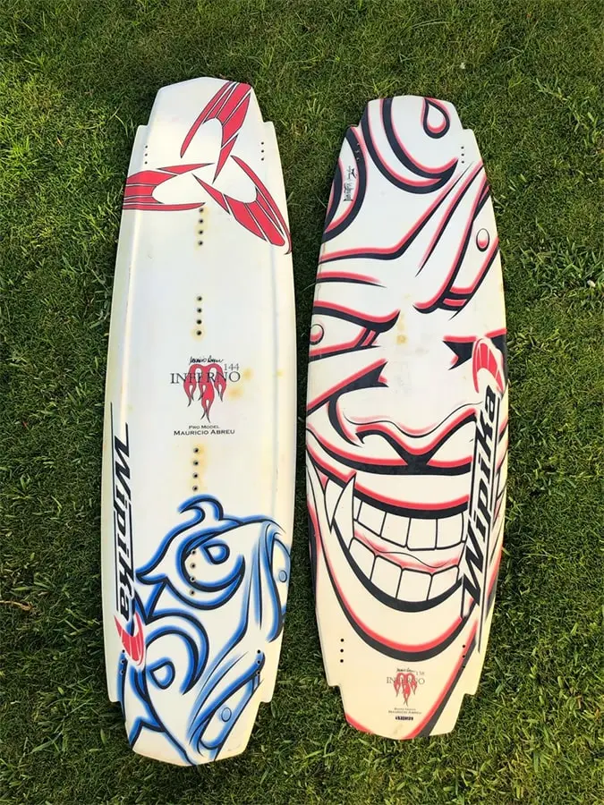
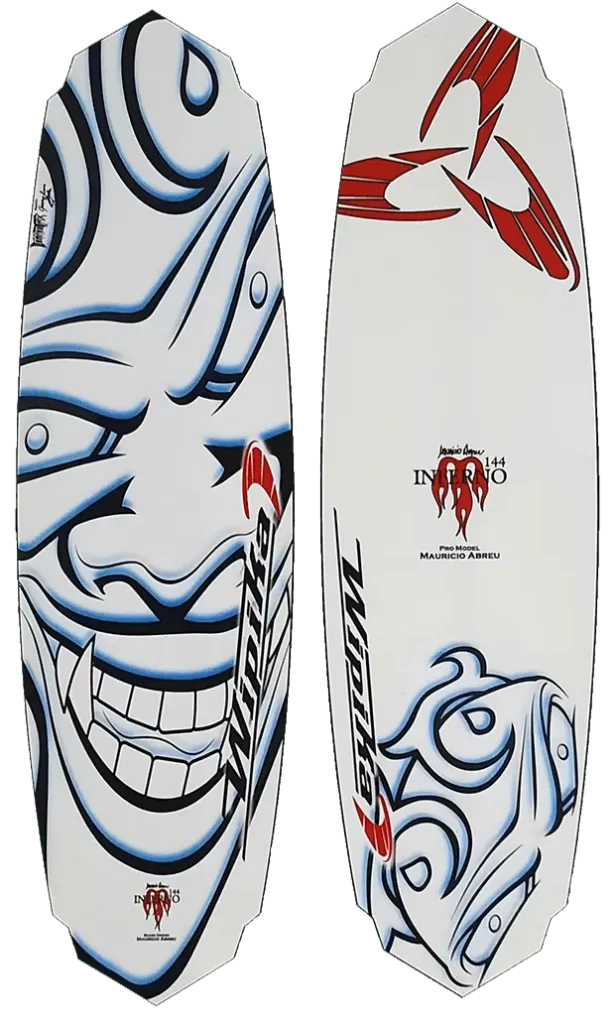
Wipika Kitesurf: Mauricio Abreu Pro-Models (1999)
In 1999, during my time living in Hawaii, I had the opportunity to contribute to a project with worldwide reach. My brother, Mauricio Abreu, was one of the pioneers and leading figures in global kitesurfing. As a Wipika athlete, he had his own pro-model boards and I was brought in to develop the visual identity for the boards that would be sold around the world.
The process was a genuine creative partnership: Mauricio would bring the initial sketches and concepts, and I would take them through to finished artwork ready for industrial production. Working in Illustrator and Photoshop, I handled the detailed vectorization of his drawings, digital colorization, and background creation. The challenge was translating organic, hand-drawn art into the technical, hydrodynamic format of a surfboard, ensuring the visual impact held up under sunlight and water glare.
These boards, including the Inferno and the Apocalypse, were more than sporting equipment. They were canvases carrying a raw, urban aesthetic to beaches. It was an exercise in both technical precision and artistic sensitivity, bridging the culture of extreme sports with the digital design technology of the era.
Design as
Contextual Strategy
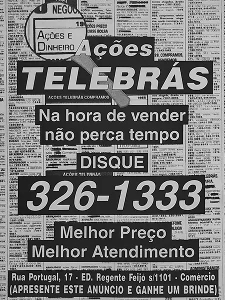
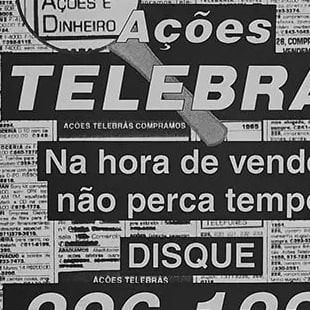
Telebrás Stock Trading (1996)
In 1996, stock trading was a deeply physical experience — Sunday newspaper classifieds were the primary reference point for most of the public. This flyer was designed for street distribution, but with a strategic edge: aesthetics.
The piece was deliberately designed to mimic the layout of a newspaper classified ad. By drawing on the visual language of ad columns and high-contrast type blocks, the design created an immediate psychological association. Readers recognized it as a “buy and sell” service before they had even read a word.
Low Budget, High Impact: Printed on newsprint, this work makes the case that good design doesn’t require premium materials. The challenge was to turn the technical constraints of black-and-white newsprint printing into an asset, ensuring the flyer carried the authority and familiarity needed to earn the trust of anyone who picked it up off the street.
Consolidation and
Offset Technique
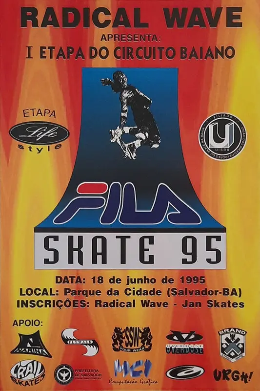
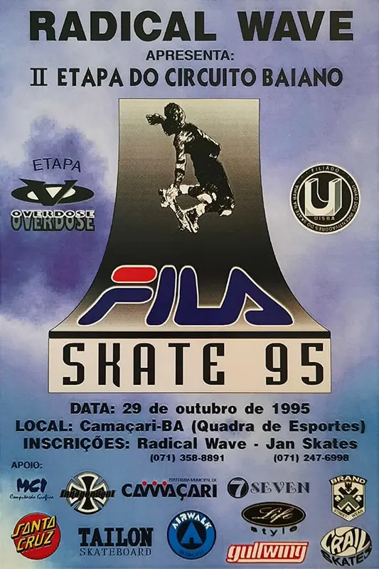
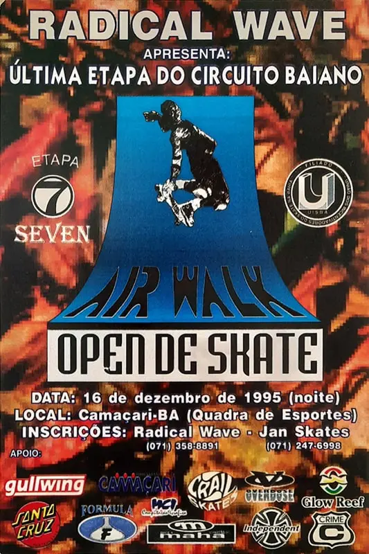
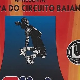
Bahian Skate Circuit (1995)
Following the success of the 1994 poster, I was invited to take on the visual identity for every stage of the 1995 championship. The challenge was to create a cohesive look across the series while keeping the raw energy of the sport alive in each piece.
Still working with CorelDRAW and Photoshop, I pushed toward a high-contrast image treatment aimed at a “drawing over photograph” effect, a way of giving the skater photos an artistic, urban quality that spoke directly to the street aesthetic of the decade.
Unlike today’s digital workflows, the process involved a complex preparation pipeline for the print shop. Color separation for film output was a critical step.
Mastering that color engineering, at a time when instant visual feedback simply didn’t exist, was essential to delivering the quality the circuit demanded.
The Dawn of
the Digital Age
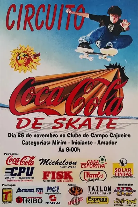
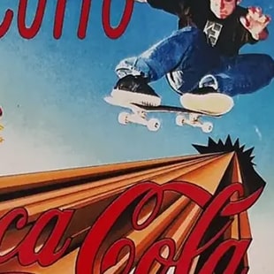
Coca-Cola Skate Circuit (1994)
This poster for the 1994 Bahian Skate Circuit marks the starting point of my design journey. Created at a time when Brazil had no commercial internet access, making the entire process an exercise in pure experimentation and patience.
Built with CorelDRAW 5 and Photoshop 3, this piece came to life in an era when most advertising materials were still produced by hand. Visual references were hard to come by, arriving almost exclusively through the rare imported magazines that made their way into our hands.
The use of vectors for the three-dimensional logo, along with the image treatment — rudimentary by today’s standards, but bold for its time — reflects the broader shift from analog to digital. With no online tutorials or stock image libraries, every texture and every effect was discovered through trial and error, pushing tools that would soon go on to define the industry standard for years to come.